|
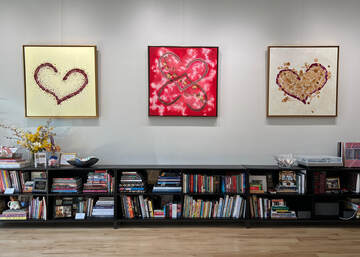
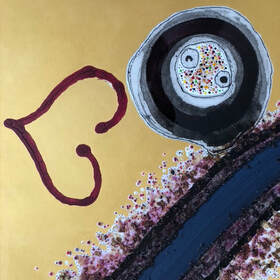
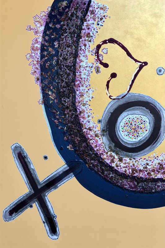
Inspired by the sunrise on January 7, 2023 during our flight from "the friendly island" of Saint-Martin/Sint Maarten [SXM] back to North Carolina, I decided to paint this moment on 2 large canvases. Starting with my #2hearts design which I created [summer 2022] from the union of side-by-side hearts, painted for my family: (1) "in memory, I love him still"; (2) "unconditional love" ...overlapping and intertwined, two became (3) "sweet on you" in the middle. Viewed together, the three paintings represent bonds between people I love. And although as individuals [grandparent, parent, child] we go about our lives separately, when gathered and considered as a whole, it's simply better.
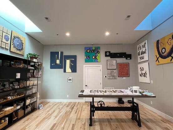
While working on "island sunrise" I focused on imageries of life beyond a place inhabited by people swallowed up in the messy ups and downs of society. It is a reference to the vastness and beauty that I see in nature and I am grounded in deep appreciation for this chance of being a painter. As the years have shown, I know that creating [writing, doodling, sketching, painting] carries my love for nature, art and enjoying this life. Once again, my heart is full. "island sunrise" is the focal point in naturally... art exhibition, April 16 through August 15, 2024. With love and gratitude, Grace
0 Comments
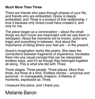
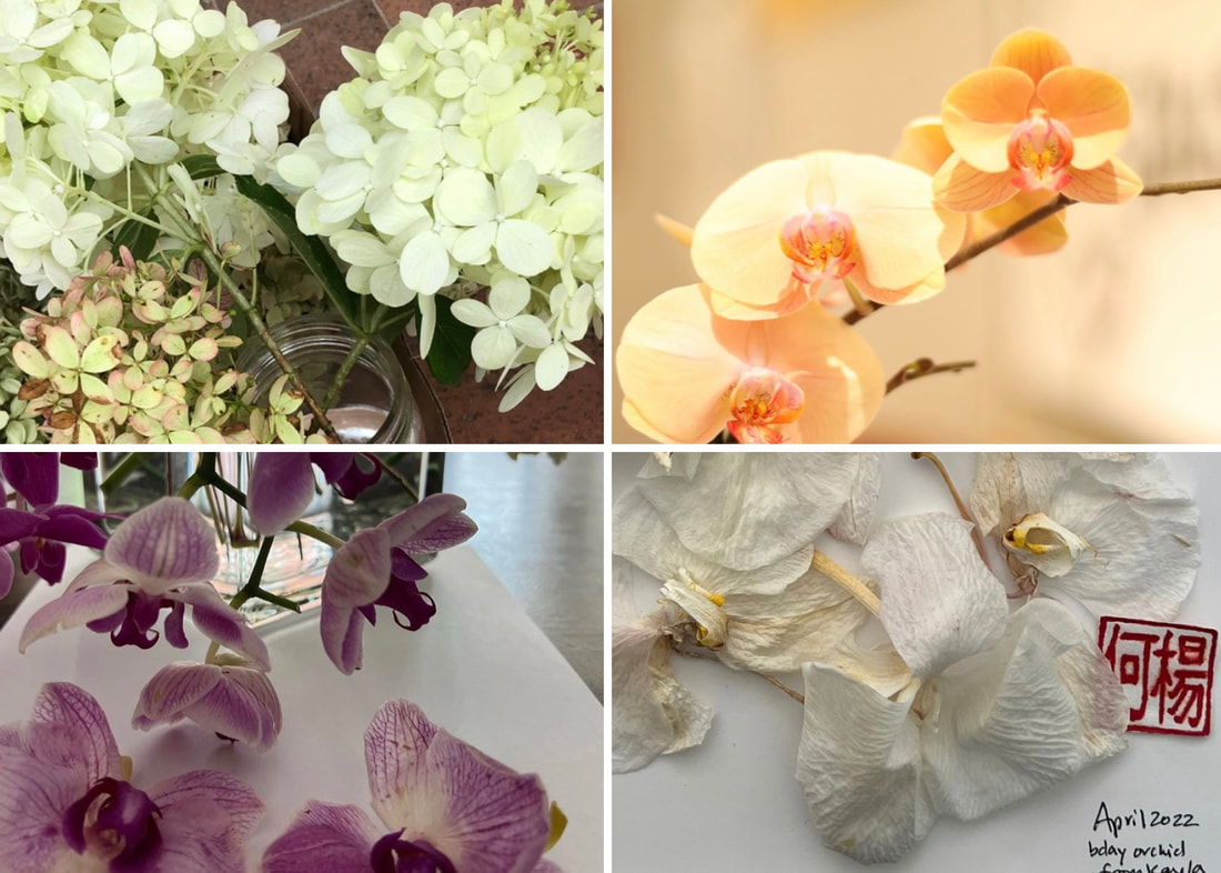
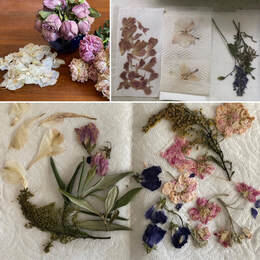
Lisa and I first met over 20 years ago while working at the hospital. Last November, she reached out to ask if I could help preserve [by way of art/framing] her daughter's wedding flowers and memorabilia. It had been a while since we last spoke so I was really happy to reminisce and catch up on life. But, I was also feeling a bit nervous: as much as I seriously love working with natural elements, I know how Nature and it's ever-changing nuances [mold] usually have a way of challenging my tendencies. Fortunately, with the comfort of wrapping my arms around a friend, it took little time to feel at ease and we fell into a familiar working groove. Lisa took care of the hard [unpredictable] part of prepping, drying & pressing the flowers. I found myself immersed in the process of making. Tucked within the steps of granting mother-daughter wishes ...deep breaths. Thank you, Lisa for allowing me to fulfill this request for you and your family. It is with permission that I share this experience knowing that Lisa's request was received in time for Christmas. As you scroll the photos, I noted one key step where we had much-appreciated help w/ the 11x14" wooden frame. Final art/framing: 2 floater frames [8x8" gold // 11x14" walnut] and 4 ornaments [three 3x3" art canvases // one 2x6" wooden bookmark]. THREE was created for my friend, Melanie. We met freshman year, fall 1986 at Tufts University. Here is one segment of our story... painted & written, I share this with her.
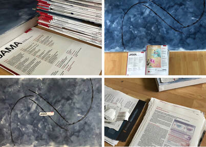
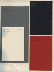
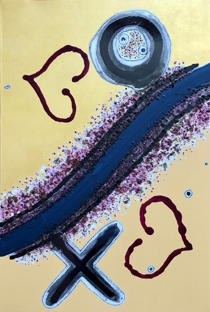
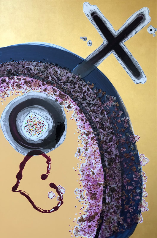
My BLUE series was not created in sequence despite the numbering 1 through 14 might lead viewers to believe. Which is also to say my next series, RED began before I finished BLUE no. 8 & 9 and no. 12. 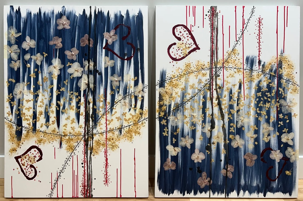 blue no. 8 & 9, two of a kind - each, 30" x 40" mixed media on canvas (POR) Blue is the organizing color along with my use of mixed media and acrylics on a variety of canvas sizes. The choice of blue to carry my work from 2020 into 2023 was intentional. Among many reasons, blue reflects three years of missing my dad, George (1930-2019). And more. 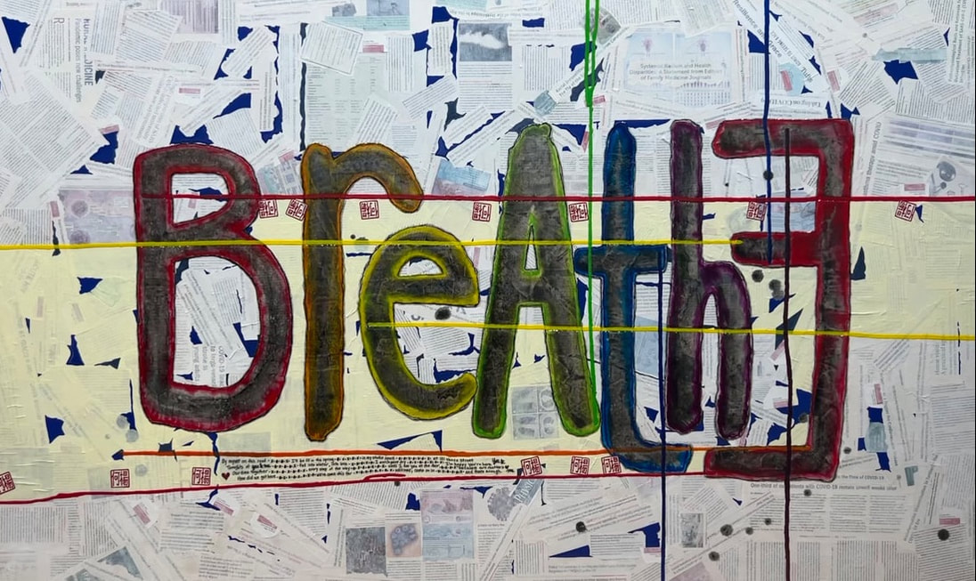 blue no. 12, BreAthE - 36" x 60" mixed media on canvas (NFS) Blue was the color we chose when we re-painted (June 2021) our building façade at 121 Vance Street. Specifically Sherwin Williams's 2020 color-of-the-year "naval" SW no. 6244, which then (Feb. 2020), I decided to use on 6 canvases (no. 5, 6, 7, 8, 9, 12) as a test run before committing to it on our storefront. The series began with blue no. 1 and from there, by working on one or more paintings on any given day, the series unfolded over the next three years: BLUE series (2020 - 2023) (click link to view updated SERIES, within ARTIST) no. 1 (hydrangeas) - February - June 2019 no. 2 & 3 - April - May 2022 no. 4 (always choose love) - October 2016 - (breaks, on & off) - August 2020 no. 5,6,7 (finding common ground) - May - October 2020 no. 8 & 9 (two of a kind) - May 2020 - (breaks, on & off) - February 2023 no. 10 & 11 - June 2020 no. 12 (BreAthE) - May 2020 - (breaks, on & off) - February 2023 no. 13 & 14 - October 2020 This month, I finished blue no. 8 & 9, two of a kind created side-by-side as one work. -- mixed media: dried flowers (from friends & family), black inks, glass beads, acrylics -- Simultaneously, I signed off on blue no. 12, BreAthE. -- mixed media: pages of medical journals & magazines, black inks, paper, acrylics --
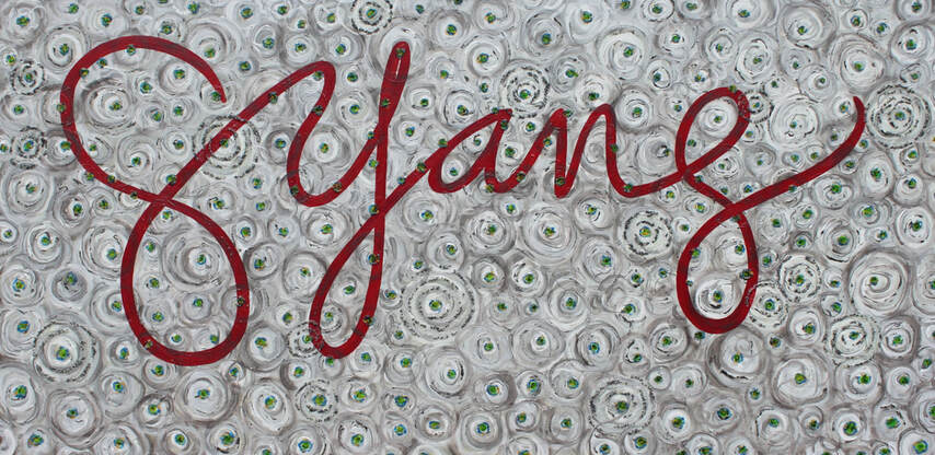
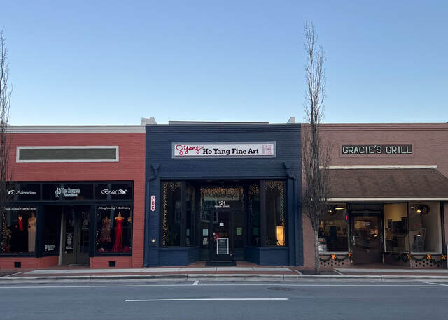
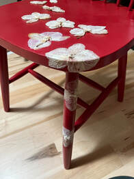
Creating each BLUE artwork was intentional, conscious, and deliberate. Making art got me through the last three years. In addition to naval SW no. 6244, we chose Sherwin Williams's "poinsettia" SW no. 6594 as the accent color for our signage at 121 Vance Street: GYang (signature) and Ho Yang Fine Art (logo). In February 2022, I started my RED series with no. 1, red chairs -- in process, not yet signed -- Today, with both YELLOW & BLUE series completed, a look back to Dragon & Phoenix (2008) -- blue orb, yellow background, signed GYang in red -- brings me full circle to RED (ongoing) as my next series and a fresh start.
also completed and signed GYang this month: #TrippingThisLife3 sketchbook (2018-2023) I remain thankful for each day filled with art & love. Sincerely, Grace
 GYang (2012) - 36" x 72" mixed media on canvas (NFS)
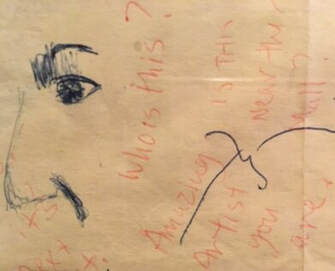
Ken majored in English while at Tufts, and he has periodically written articles for our local paper so I am deeply touched that he took time to write his version of our story, "Fine art from sketches on a yellow notepad" published in The Sampson Independent (Sat. June 11, 2022).
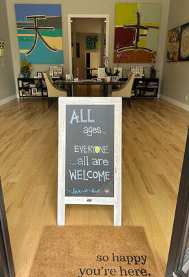
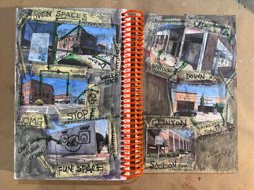
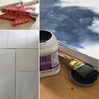
 04/19/2022 photo - studio space at 121 Vance Street In 2017 I wrote, "How we met twice in a lifetime..." from the moment he scribbled on my yellow notepad, I was smitten and I remain undeniably biased, Ken is my favorite writer. Finally trying out the iMovie app on my phone (old dog, new tricks...). This video, Fine art from sketches includes pages from my sketchbook (art-work created for University of Florida, Masters of Art in Art Education, Summer Sketchbook course 2014) and is dedicated to my husband & our parents, our children, and our community (near & far): thank you, thank you, thank you. I had a lot of help getting here. And I am grateful to be (still) figuring out life with all of you, all ages ...all are welcome.
In the living room hung a single original work of art: pink blossoms, dark gray branches, a calm composition of nature's beauty, all hand-painted strokes of ink. I don't know where the painting is and any trace of it has disappeared. Growing up, I didn't know that my mother painted at some point before being a parent. And it was during her earlier years as a grandmother when she decided to tell me about the original piece in the living room. She spoke briefly about technique and chose to say little else. I had hoped the moment would last a bit longer.
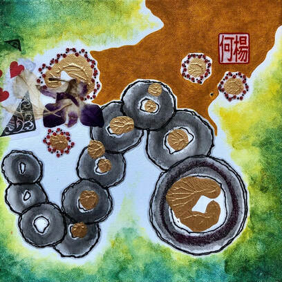
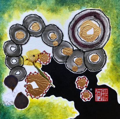
Remembering when I first met Emily, it was May 2017 at Yankee Stadium with Casey wearing his Red Sox hat, celebrating graduation day - fun, beautiful, brave, happy, brilliant. With the warmth of their connection, I asked Casey about the design of their engagement ring and began working... sketching larger circles followed by smaller ones, playing with gold on white. 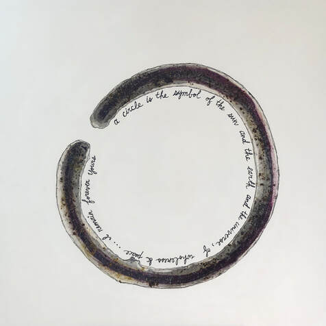 renewal (2018) - 36x36" mixed media on canvas (dried flowers, black inks, chalk pastel, acrylics) - private collection Then, using the circle motif in "renewal" (2018), I began to paint: first in black (ink purchased in China); then, in gold with rings that reflected canvas no. 1 with no. 2, canvas no. 3 with no. 4. To balance the spaces between brush strokes, other elements were added: dried flowers (mother-daughter); a variety of red and green beads (Christmas); red pigment to stamp the Ho/Yang chinese characters on rice paper (art signed GYang); white and violet (NYU colors); yellow and blue to make green (the color of Emily and Casey's couch). Four pieces, each entitled, "engaged" -- art elements, moments with loved ones, memories we share -- apart/together, awaiting new stories to be told.
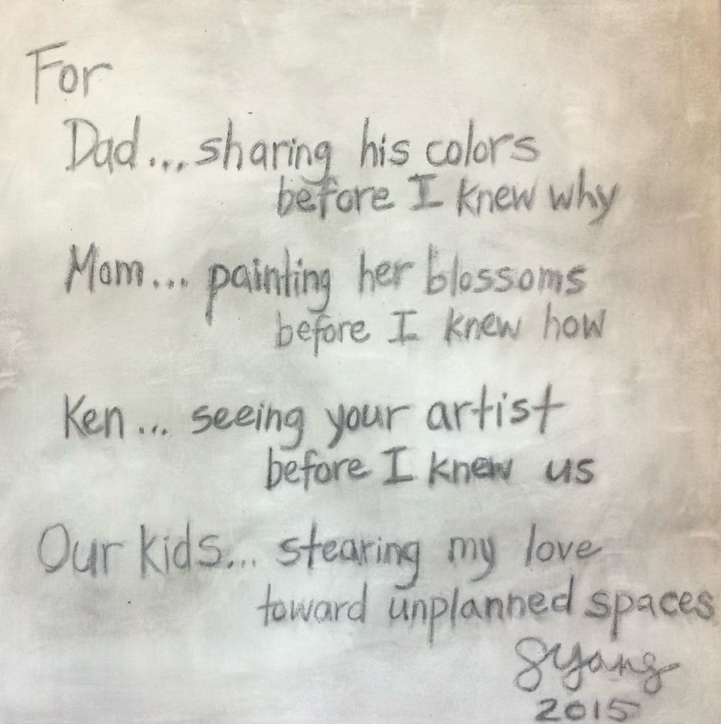
Cheers, Casey & Emily (engaged no. 1 & no. 2) Merry Christmas, Tran Family (engaged no. 3 & no. 4) "For Mom... painting her blossoms before I knew how" (2015) In time, she showed me how. 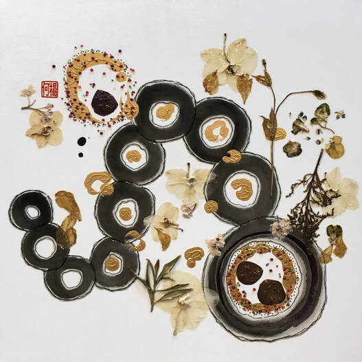 engaged no. 3 - 24 x 24" mixed media on canvas 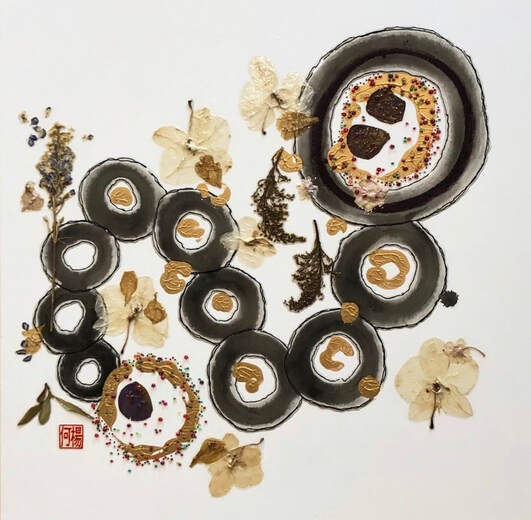 engaged no. 4 - 24 x 24" mixed media on canvas 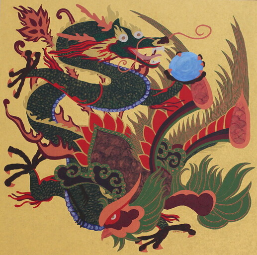 Dragon and Phoenix (Dec. 2008, 15 years) - 30x30” acrylic (private collection) This morning, Ken pinged my whatsApp with a NYT article; in brief, they ran the presses to say the institution of marriage is fading. I messaged him back our usual, 1234 before taking the next few minutes to read the news. Which brings me here, how far back do I go. Seven months and 7 days after our first date. In the winter of 1990, the proposal of marriage did not happen by tradition. Quiet, cold, evening - just the two of us. He said, I want to spend my life with you. Me, what?! Then, flowing with the spontaneity of the moment, he gave me an invisible ring as a place holder. After it skipped a beat or two, I gave him my heart. Me, Yes! Three years later, the wedding took place only because we canceled the elopement. More recently, I lost the heart-shaped diamond that sat squarely on my engagement ring. We searched everywhere. I crawled on the kitchen floor and did not find it. No diamond would ever measure up to invisible. Sometimes I like to say, I married up. And, according to the NYT article, we got a license with tax benefits as part of the deal. Commitment is about Up’s and all the Down’s. It’s an affair of the heart with aches and pains that leave cracks, chips, broken pieces that we try to repair every chance we get. It’s more than just, I do. It’s often times about, we will. Live, love, cherish this chance at life. You are and will be my one and only forever.
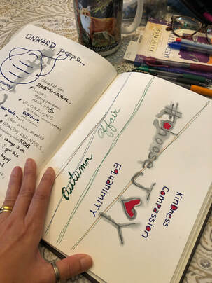
As we approach the end of our renovation project, the one person who has stood by my side is still here. Long before the purchase of our property at 121 Vance Street (Clinton, NC) in June of 2019, we promised to spend our life together. In sickness and in health, the journey continues. Onward, peeps ❤️❤️❤️❤️ NYT article: The Married Will Soon Be the Minority https://www.nytimes.com/2021/10/20/opinion/marriage-decline-america.html?referringSource=articleShare
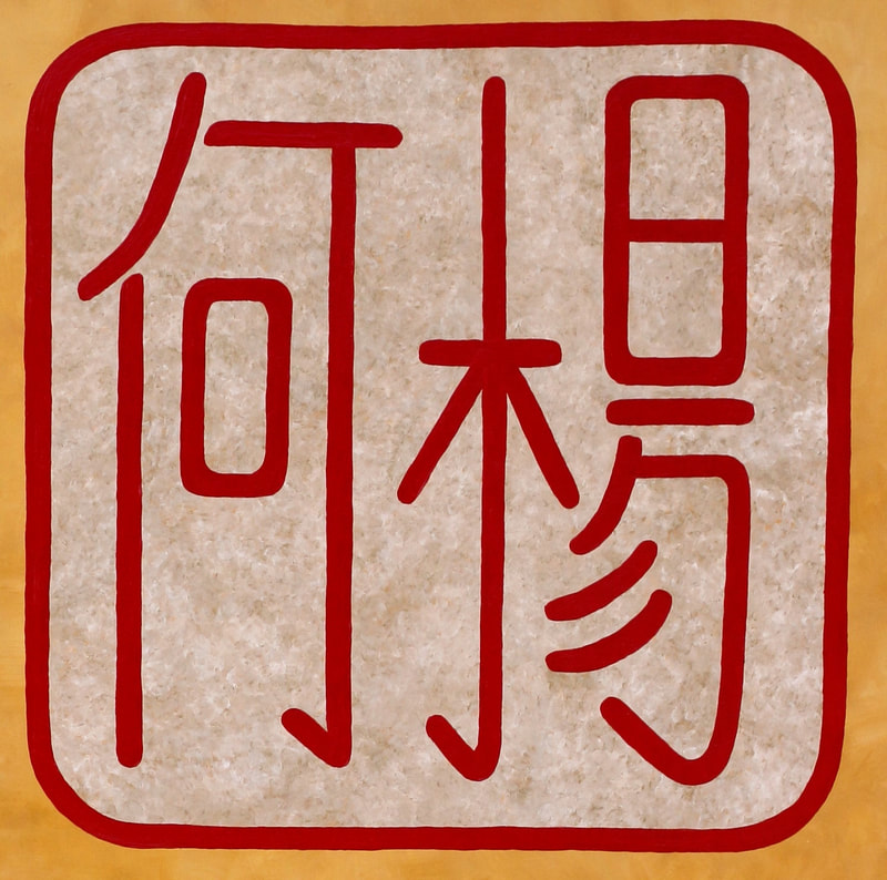
 Younger me believed in keeping my birth name as I grew into adulthood. I imagined my medical degree, white lab coat, name tags... the usual identifiers labeled with "Dr. Ho" in honor of my family. At 21, I had not planned on finding a friend who would embrace what it means to keep my family name. As a tribute to us, I sign all art-work GYang - a reflection of me, Ken and our life together.
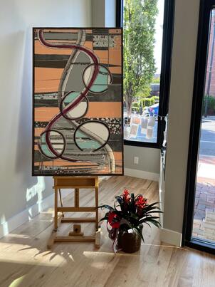
In the art world, consider the name given to a painting; the title, even when labeled "untitled" suggests something about the work. Each painting holds stories not only about the art and its artist, but also stories imagined by its viewers. The deeper impact, beauty and wonder exist in these stories that live beyond the title and visual first impressions. Recently finished: "finding common ground" (#BLUE no. 5, 6, 7) - 3 side-by-side canvases, each 24x36" mixed media (black inks, chalk pastels, dried flowers, glass beads, acrylics)
So when we meet, after that first, "hello, my name is..." I hope to have the chance to swap stories. It's about understanding who we are, what we don't know, how we care for one another and choose to be together... imagine the stories we share.
Dedicated to strangers, the ones unafraid to walk this path with me, with us -- Asian Americans & Pacific Islanders -- it's worth repeating, Thank You. updated Feb. 08, 2023 #BLUE series (2020-2023)
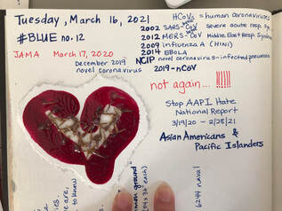
In February, I started my #BLUE series with familiar materials: dried flowers, black inks, red glass beads, acrylic paints & mediums to create “hydrangeas” (36x36” canvas, #BLUE no. 1). Since then, I’ve been using varying sizes — 6x6” (each, no. 2, 3); 20x60” (no. 4); 24x36” (each, no. 5, 6, 7); 30x40" (each, no. 8, 9); 8x10" (each, no. 10, 11); 36x60” (no. 12) — to explore new ideas. 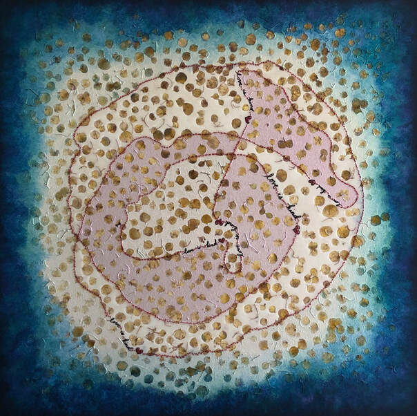 hydrangeas (my lucky #6) - 36x36" mixed media on canvas - #BLUE no. 1 While working in my art studio, I listen — to the news, music, friends, family, or nothing but the movements around me: wheels of my easel rolling, birds living outside, Jinx barking at the delivery truck in our driveway, the tired hum of our 15-passenger van bringing Ken back home. And sometimes when I’m not painting, I’m reading. Admittedly old-school and nerdy, turning paper pages of hard-covered books and medical journals that arrive by snail mail are my favorites. Creating, working, listening, reading, learning... all reminders that I’m lucky to have another day. 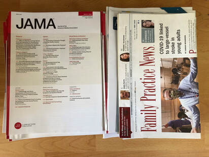 medical journals since mid-March 2020  always #chooselove - 20x60" mixed media on canvas #BLUE no. 4 - private collection Art reflects life — feelings & emotions, thoughts & actions, places & moments, friends & strangers. These days, the process of using blue in my art inherently reflects sadness: too many lives lost and devastatingly impacted by extraordinary events. I miss seeing smiles on faces, going to faraway places, being with you in person, doing seemingly ordinary things. Focusing on blue may seem ordinary, that is, before that initial curiosity grows with exploration. Then, using navy blue in series to reveal its potential — vast, far reaching, deep, peaceful, calming — becomes an unexpected source of joy. 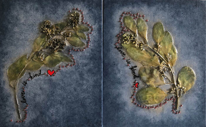 #BLUE no. 10, 11 - Leaves, R & L - mixed media on 8x10" each, grey toned panel - private collection As winter approaches, I’ll continue to take breaks from extraordinary. Look and listen in spaces without noise. Be curious. Choose from my stacks of favorites. Read. Explore new ideas. Learn. Make art. And hope you’ll find joy, perhaps even in something blue. View process photos updated Feb. 08, 2023 BLUE series (2020-2023), Gallery. Please continue to take care, be safe, stay well and mask up. With deepest gratitude and love, this is dedicated to Dad (R.I.P. Sept. 2019) and Mom ...married 50+ years today. #becauseARTmatters ❤️ As an artist, my work reflects life. As a retired family physician, my mission to serve people from different walks of life remains a purpose. Amid the pain, suffering, dying and deaths, my heart aches for humanity. I remain hopeful for better times when I see small and big acts of kindness happening in neighborhoods, communities, nations ...all over the world. Healing takes time. |
AuthorOwner of HYFA. Original artwork signed GYang. Artist, educator, and advocate ...because art matters. Retired Family Physician. Archives
April 2024
Categories |


 RSS Feed
Ho Yang Fine Art™, LLC
© 2008-2024 original Ho Yang Fine Art art/work belong to Grace W. Ho.
DO NOT copy in part or whole, re/print, re/produce, re/distribute, claim rights to HYFA art/work.
© 2008-2024 original Ho Yang Fine Art art/work belong to Grace W. Ho.
DO NOT copy in part or whole, re/print, re/produce, re/distribute, claim rights to HYFA art/work.